
1.


 The FedEx logo is a creative one! At first glance all you can really notice are the two different colors, but if you look closely you can see an arrow is created between the spaces of the letter 'E' and 'X', representing the company's forward-thinking ways and outlook towards the future.


Yeah, it's a peacock, but did you ever wonder why it has so many colors? That's because, during the '50s, NBC's owner was RCA and they had just begun to manufacture color televisions. Since RCA wanted people still watching on black-and-white TV to know what they were missing, NBC created a colorful logo to adapt to the new technology.
2.
Four hoops...plain and simple, right? Well, wrong. In fact, each of these hoops represent the 4 founding companies of the Auto-Union Consortium way back in 1932: like DKW, Horch, Wanderer and Audi.
3.
At first you just see the word VAIO, but look a little closer and you'll see the first two letters represent an analog symbol and the last two letters are binary.
4.
Take a look at what's highlighted in pink. Look familiar? It's a 31, which is the number of flavors they offer.
5.

The Mitsubishi logo is rooted deeply in history. It combines the three-leaf crest of the Tosa Clan and the three-diamond crest of the Iwasaki family. The three diamonds represent reliability, integrity, and success. But it doesn't stop there. The word "Mitsubishi," according to Penske Social, translates to "mitsu" (three) and "hishi" (water chestnut, used in Japan to mean a rhombus or diamond shape).
6.
Your initial thought when looking at the Amazon logo might be that the arrow looks like a smiley face, meaning Amazon is there to make its customers happy. Well, notice that the arrow is pointing from the a to the z; representing the fact that Amazon provides a variety of items for sale, literally from A to Z.
7.
Yes, it really means "M" for McDonald's and there really isn't any other meaning McDonald's had intended. Instead, it came to mean something unintentionally by customers, at least according to design consultant and psychologist Louis Cheskin. In the '60s, McDonald's wanted to change their logo but Cheskin insisted on leaving the golden arches. He said it's because customers unconsciously recognize the logo as "symbolism of a pair of nourishing breasts". Whether we unconsciously believe this or not, Cheskin convinced them and now the logo is one of the most recognizable in the world.
8.
Ever notice how the Google logo has four primary colors in a row then it's broken by a secondary color? This was entirely intentional. Google wanted to show that they don't play by the rules and are also playful without making the symbol bulky. To do that, they just used simple letters and colors.
9.
10.
In 2008, Pepsi spent $1 million to pay Arnell Associates to come up with the new logo (the old is the on the left and the new on the right). As a result, Pepsi had to pay millions more to re-brand everything. Then Arnell's document was leaked and it was entitled, "Breathtaking Design Strategy." It proposes that the new logo is some kind of Da Vinci Code. According to Arnell's document, the Pepsi logo draws on Feng shui, the Renaissance, the Earth's Geodynamo, the theory of relativity, the universe, and more. For more, read it over at Gawker. There you have it: the Pepsi logo is the key to the universe.
11.
IBM’s logo has a hidden message for the whole world hidden in the Big Blue logo that represents it’s company. The white lines passing through give the appearance of the equal sign in the lower right corner, representing equality.
12.

The three ellipses that are found in the logo for Toyota represent three hearts: the heart of the customer, the heart of the product, and the heart of progress in the field of technology.
But everyone knows that by now. What some people don't notice is below, which is simply genius.

13.
Unilever produces so many different products that sometimes it's hard to keep track of everything they do. Lucky for us, there's symbols for literally everything they make right in their logo.
15.
As long as I can remember, the BMW logo has been associated with a blue sky and a propeller spinning, going back to its aircraft-building days. But what if I told you that wasn't the original intention? According to NYTimes, the trademark was registered in 1917, but the propeller association wasn't created until a 1929 advertisement where the logo was featured alongside an aircraft. What does it mean then? The colors are blue and white to represent the Bavarian Free State colors. The reason it looks how it does is because using a national symbol in a commercial trademark was illegal, so the colors were arranged in an opposing order. There you have it.
16.
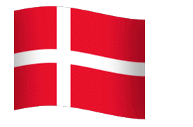
Look closely at the "o." Do you notice anything? No? Don't worry because most people wouldn't notice it. It's actually the Denmark flag. This wasn't always the original intention. Coca Cola discovered that part of its logo looks like the Danish flag, which has been named the happiest country on earth. Once they discovered that, they set up a media stunt in Denmark's biggest airport, where they welcome people with flags. Still can't see the flag? Here you go:
17.
The FedEx logo is a creative one! At first glance all you can really notice are the two different colors, but if you look closely you can see an arrow is created between the spaces of the letter 'E' and 'X', representing the company's forward-thinking ways and outlook towards the future.
18.
No, the Pac-Man reference is not confirmed, but it's cool to look at anyways. There is hidden meaning in the LG logo, though. Everyone knows the face, but its position, as well as the "L" and "G," inside the circle that matters. According to LG, this centers humanity above all else. The circle itself symbolizes the world, future, youth, humanity, and technology while the red represents friendliness. (Hint: a lot of companies use red for this very reason, as it seems to attract consumers a lot.)
19.
Ever notice that Adidas' symbol looks like a mountain? Well, that's exactly what it's supposed to mean. The three stripes, which was part of the original logo in 1967, never really meant anything. It was just supposed to be unique. In the '90s, though, they slanted the stripes so that it would represent a mountain, which stands for the obstacles people need to overcome.
20.
Do you see anything unusual about this Microsoft logo? Is there some form of hidden message here? Don’t feel bad if you don’t see it. Several years ago, I asked a dozen people if they detected anything unusual or cool about the logo. They all said no. Microsoft’s message may be a little too covert, but if you look hard enough, you’ll see it.
Here’s a hint: What product does Microsoft specialize in? The cut in the letter “o” suggests a continuation to the letter “s”, as in operating systems.
So how many logo secrets were you knowing.? comment below and like our Facebook page for more interesting posts.
No comments:
Post a Comment